
👩🏻💻
[CSS] 그리드 레이아웃(Grid Layout) 본문
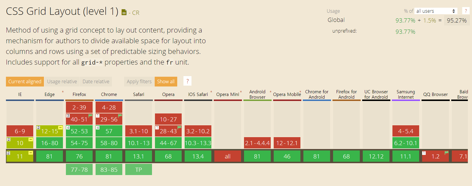
caniuse라는 HTML, CSS, Javascript의 기술들을 웹브라우저들이 얼마나 채택하고 있는지에 대한 통계를 볼 수 있는 사이트에 따르면, CSS의 Grid Layout은 거의 모든 웹브라우저에 적용시킬 수 있고, 전 세계 95.27%의 사용자들이 이 기술을 적용한 사이트를 이용할 수 있다는 것을 알 수 있습니다. 이처럼 Grid Layout은 웹페이지에 레이아웃을 구현하기 위한 아주 유용한 기술입니다.
Can I use... Support tables for HTML5, CSS3, etc
About "Can I use" provides up-to-date browser support tables for support of front-end web technologies on desktop and mobile web browsers. The site was built and is maintained by Alexis Deveria, with occasional updates provided by the web development commu
caniuse.com
1. 그리드 레이아웃 적용하기
그리드 레이아웃을 적용하기 위해서는 먼저 div 태그를 이용하여 자식 요소(item)들을 부모 요소(wrapper 또는 container)로 감싸주어야 합니다.
<div class="wrapper">
    <div>1</div>
    <div>2</div>
    <div>3</div>
    <div>4</div>
    <div>5</div>
    <div>6</div>
</div>
1, 2, 3, 4, 5, 6 이라는 요소들에 그리드 레이아웃을 적용하기 위해 각각의 요소들을 div 태그로 구분해주고, 모든 요소를 하나의 div 태그로 감싸준 후, class를 설정해줍니다.
이 부모 class에 display를 grid로 설정하면 그리드 레이아웃을 적용할 수 있습니다.
<style>
.wrapper {
	display: grid;
}
</style>
display: grid 는 block 특성, display: inline-grid는 inline 특성을 가집니다.
2. 행, 열 설정하기
<style>
.wrapper {
    display: grid;
    grid-template-columns: 50px 100px 50px;
    grid-template-rows: 100px 50px;
}
</style>
grid-template-columns와 grid-template-rows에 각각의 행과 열의 크기를 나열하면 다음과 같이 표현됩니다.
|
1 |
2 |
3 |
|
4 |
5 |
6 |
<style>
.wrapper {
    display:grid;
    grid-template-columns: 1fr 2fr 1fr;
    grid-template-rows: 2fr 1fr;
}
</style>
fr을 사용하면 전체에 대한 비율로도 표현할 수 있습니다.
또한, grid-template-columns: 100px 100px 100px 100px과 같이 같은 숫자나 패턴이 반복된다면 repeat함수를 사용하여 간단하게 표현할 수 있습니다.
위 예제는 2개의 행과 3개의 열에 대한 크기만 정의되어 있습니다. 여기에 아이템을 추가하면 아이템의 크기에 맞춰 다음 행에 표시됩니다. 이렇게 명시적 행 외부의 암시적 행의 크기를 원하는 값으로 정의하기 위해서는 grid-auto를 사용합니다.
<style>
.wrapper {
    display: grid;
    grid-template-columns: 50px 100px 50px;
    grid-template-rows: 100px 50px;
    grid-template-columns: 100px;
    grid-quto-rows: 100px;
}
</style>
3. 아이템 배치하기
아이템을 임의로 배치하기 위해서는 먼저 자식 요소에 class를 설정해주어야 합니다.
<div class="wrapper">
    <div class="item1">1</div>
    <div class="item2">2</div>
    <div class="item3">3</div>
    <div class="item4">4</div>
    <div class="item5">5</div>
    <div class="item6">6</div>
</div>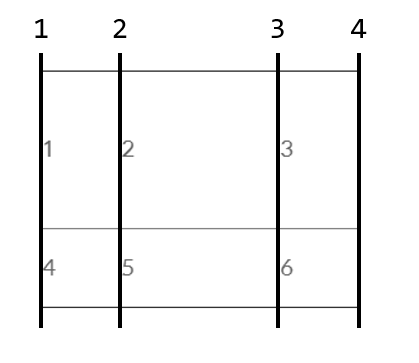
왼쪽 선부터 숫자 1, 2, 3, 4가 부여되므로,
.item1 {
    grid-column-start: 1;
    grid-column-end: 4;
}

.item3 {
    grid-column-start: 2;
    grid-column-end: 4;
}
위 코드를 추가하면 다음과 같은 결과를 얻을 수 있습니다.
|
1 |
||
|
2 |
3 |
|
|
4 |
5 |
6 |
grid-column: 1 / 4; , grid-column: 2 / 4;로 간단하게 표현할 수도 있습니다.
- 2020/05/24 수정
'WEB > HTML & CSS' 카테고리의 다른 글
| [HTML/CSS] 웹페이지에 폰트, 아이콘 추가하기 - 구글 폰트(Google Fonts), Font Awesome 사용법 (0) | 2020.07.30 |
|---|---|
| [CSS] 미디어 쿼리를 이용한 반응형 웹 만들기 (0) | 2020.06.01 |
| [CSS] 박스 모델 테두리 만들기 (0) | 2020.05.22 |
| [CSS] CSS 선택자 기본 정리 (0) | 2020.05.20 |
| [HTML] 웹페이지에 여러 기능을 추가할 수 있는 사이트 정리 (0) | 2020.05.13 |


